Passionate colleague and friend posted a familiar Steve Jobs quote the other day. It goes –
“Design is not just what it looks like and feels like. Design is how it works”. And that just made me wonder where we all are at this point.
The Design of Everyday Things, Keeping it Simple
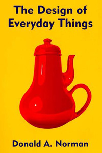
A while back we posted a list of 8 Books Every Designer Should Read, and among those books was a book I believe is a “must read” for every designer: The Design of Everyday Things by Donald A. Norman. In my opinion the book wrote by Donald A. Norman should be mandatory reading in all design related classes because it shows us amazing examples of good and bad designs, besides explaining through psychology and cognitive science why people like some things and dislike other. Even though the book was published in 1988 (its first version) it is still a masterpiece. His explanations of understanding something to use it seamlessly are really nice.
Since I believe that to deliver better designs we need to understand how people think and what they expect from things, I really liked to read about all Donald’s concepts. It doesn’t matter if you are a web, graphic, product or package designer, you can certainly take some good information from the book.
After reading the book I started paying attention to “everyday things” designed in a simple and minimal way. Things as cutlery, pans, mugs, tables, chairs, etc. Things we know how to use and we know that they don’t need “extra elements or details” to work. Things we know that may be super simple and deliver the same result. This is why I had the idea to gather some everyday things beautifully designed to inspire you.
Why Designers and Content Strategists Need to Work Together
Design and content are two sides of coin. They are both necessary for an effective website.
Imagine yourself in a grocery store searching for a package of flour. On the shelf, side by side, are two bags. Both bags contain the identical type and amount of flour. Both bags cost the same amount of money. But one bag is beautifully designed with an eye-catching graphic. The other bag is plain beige and the only design element is the word “Flour” in a plain font.
Which bag would you be most likely to notice?
Read the rest on ‘Why Designers and Content Strategists Need to Work Together’ here.
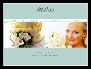
A florist website that uses a simple slideshow to highlight the beautiful arrangements and art that is showcased in this Barwon Heads store.
I’ve been in this game for a hot minute now, and I have to say that momentum is one of the most crucial aspects in deciding whether or not a project succeeds or fails. The momentum is built upon two notions: getting inspired and staying inspired. Accomplish these two things by keeping things moving forward and shipping as quickly and as often as you can until the project is done.
This may mean shipping something ultra-simple and mind-numbingly stripped down at first, but it’s an honest approach that keeps your momentum while allowing your customers to continually be involved in the quick evolution of your product.
That’s how you get things done. That’s true productivity, and it doesn’t even require software to disable your twitter or facebook feeds. Just build it.
What is the drive behind the designs we do? It’s easy to get caught up with being creative, but at the end of the day, any creativity amounts to nothing if detached to purpose. Something to think about.
(via Vandelay Design)

